Building UI/UX for Mobile
The rubber hit the road as we took on proper UI/UX development into our studios.
It was a learning curve, but definitely worth it with the ever-changing interactions users had with their devices. Taking the time to truly build out rewarding user experiences was a goal I set for myself and my teams.
Below is a body of UI/UX work that did within my years at Scientific Games


The Cosmos project was a B2B initiative that required my team and I to build a front end UI/UX journey as well as a back end portal application. I spearheaded the project with lo-fi wires and design of the front-end animation and iconography.


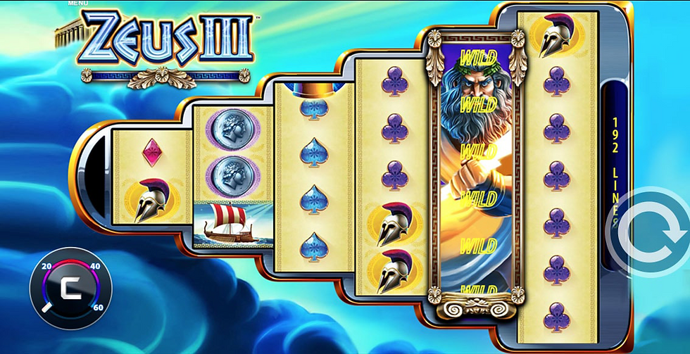
I built these storyboard stills to illustrate how the speed meter in the lower left-hand corner would behave with one of our most popular existing games, Zeus III. This look was still in the prototype phase as we continued to refine the themes and potential animations.
This is a Motion Mock for the Scientific Games Cosmos project. The goal was to gamify the online slot player experience by offering a meta game element. We'd reward them extra spins and play time across a variety of slot games. I led the asset creation and art direction on this project.


With newer devices releasing every year and the multitudes of resolutions, my team and I had to solve for the future. The goal was to build an elegant and readable game experience that could adapt to change quickly. I steered the project toward a floating UI when needed and anchored the essential data at the top and bottom of the screens. This also helped us deal with games that went into portrait mode. I led the asset creation and UX direction on this project.


My team and I were tasked to explore the UI/UX of all the games on our global platform. The goal was to build a new more fluid mobile-first user experience that also lent itself to desktop usage. Here are a few mockups of the wireframes that I built for play testing and analytics. I led the asset creation and UX direction on this project.
This is a Motion Mock for the Mobile Game Menu project. The goal was to show the stakeholders how this would function and flow. I led the asset creation, art direction, and animation on this project.